2020 - current
Sigmaringer Str.23 | 10713 Berlin
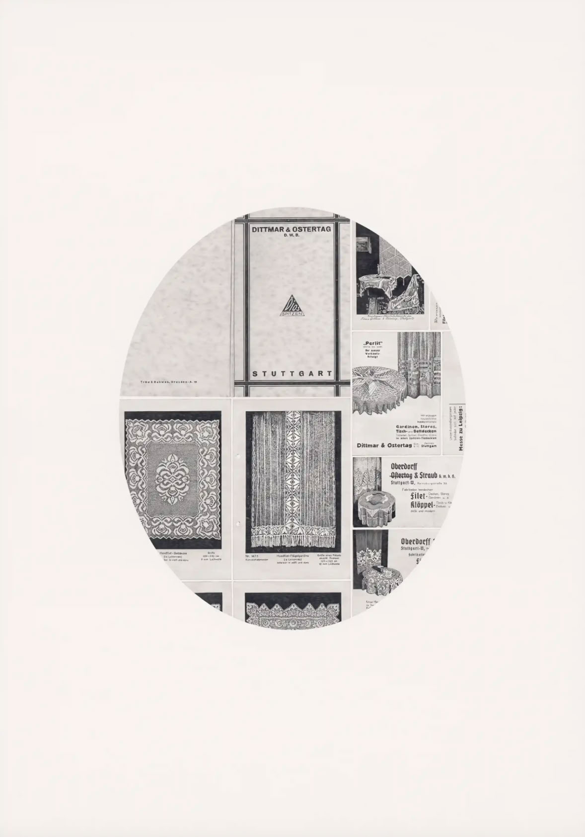
Herbert Stattler's ‘Spitzenwaren’ is the show to the book. The book was published a few weeks ago under the title ‘Spitzenwaren. Ein Album 1900-1954', has just made its first appearance at the Leipzig Book Fair and was very well received. The blurb says :
“Herbert Stattler explores a history with 38 drawings encompassing other and further stories. It revolves around the biography of a Stuttgart company that commissioned and distributed lace ware. Stattler's drawings are based on the company’s archives, offering a kaleidoscope of fragments of time, revealing simultaneously textile, technical, cultural, and consumer history. Since the plots concerns the history of handwork, Stattler's series not only addresses their techniques but also the working conditions of female home-based labor. This extends the album into the realm of social and economic history in the first half of the 20th century: World War I, the turbulence of the Weimar Republic, the rise of the Nazis, and World War II. However, lace ware production is not limited to purely material and historical dimensions. Its patterns echo significant aspects of both older and more recent art history. We see the evolution of ornament—from its rise in the Renaissance, its devaluation as mere decoration, even a »crime« according to Adolf Loos, to its emancipation as an aesthetic practice of autonomous form finding.”
An ambitious and broad-based endeavour. And one could be forgiven for thinking that Stattler's drawings within that context are simply in the service of a historiography. In other words, that it’s drawing that offers exquisite draughtsmanship providing ultimately just documentation, as was customary before photography, especially in biology and botany. An ‘employed’ drawing, so to speak, and one could argue that Stattler's pricing fits in well with this. The purchase price of his prints is the product of the time spent on them and the statutory minimum wage. The driver of the not so trivial prices resulting from this calculus is certainly not the statutory minimum wage. The perseverance and obsession with which Stattler burrows into the depths of a company archive in order to finally unearth with that same obsession the treasures as drawings of course, end in “employed” drawing. Obviously, it is not just about documenting as much detail as possible, which photographic processes would do much better. But what else?
The show will close on 10 May with a presentation of the book. Martin Bauer will read. He contributed 38 excellent texts to the 38 graphic works presented in the book and a long interview with Stattler. Responding to Bauer’s question what’s going on inside him when he draws Stattler explains:
“When things are going well and the concentration is there, when it’s quiet and nothing is disturbing me, then I can reach a state of consciousness—it’s hard to describe—where conscious control disappears, as if it were switched off. Then the hand draws by itself. Such a state of mind is like a gift, a great stroke of luck. When hatching, my hand automatically starts at the correct place at the end of the last line and applies the same pressure as if operating on its own. It is a kind of flow that bursts forth, carries me while I draw, and propels me forward. My greatest fear, which is always with me, is that I will suddenly notice this flow and then become startled. At that moment, it’s all over. I can simply forget the next lines, they are no longer even, the approach is no longer right. I often find myself playing this game of risk with my inner states.”
Reading the book and this long interview is warmly recommended to visitors of the show. In particular Stattler's comments quoted above help understand that every good drawing is ‘employed’, that the hand that draws – by the way, just like the hand that makes the lace - performs a self-forgotten service. Not the minimum wage, but this time lost in an entirely absorbed activity, recorded and remembered in the drawing, is key for the drawing. It is eventually the happiness Stattler refers to, the happiness resulting from this different and not at all historiographical mode of remembering and forgetting in that flow of time lost in the drawing, that ignites the archival findings compiled in the album. Findings that with Bauer's excellent texts thrive to an astonishing debth and breadth of cultural history.
Thus, if you read Stattler's drawings properly, if you immerse in the obsessively minute detail of what Stattler calls the abstraction of his drawing, you will not only understand the half century of complex and multi-layered history that the Spitzenwarenalbum covers. You will also experience the proximity of his drawing to the exclusive moments in recent performance history, such as offered by Tehching Hsieh and Hamish Fulton. Stattler's drawing is a reflection on time, which is always also one's own lifetime. A long and slow time at the pace of the minimum wage, but in a completely different currency.
Opening 12 April from 6pm

'This “in the garden” is misleading in a way. The show is about a biotope that has little to do with garden. It's really about construction, construction sites. And Jane Garbert has a perfectly hands-on relationship with construction sites.
But with a gardener's eye. And well beyond the works on show (download portfolio). Missing for instance is her excellent video recording the choreography of a worker gluing roofing felt. A look at labour, real labour that obviously still exists; and Garbert shows its breath-taking functional grace. 'Raven 1' is another one also missing. The tar pot (with beak), overflowing black glue, black as only tar can get. Raven 1 is a recurring item in her shows. This time not on show - but still very much around.
It's Garbert's gaze and it's instrumental for her work and her shows. Often staged as installations, they never squander the subject, never betray it by some (malodorous) intrusion of real objects. There is an important element of ready-made in her work, but without the ingratiating mode of the documentary. It is not about souvenirs from another, more banal world. Instead a subtly dosed directing that in the moving image of dancing work, in the dark black and painterly overflowing tar finds poetry (word that rarely happens to me). Poetry of that hands-on type.
That's the garden. It thrives in the gallery in the subdued light that falls through the large windows covered with a greenish protective film. A biotope well heated also in winter. And with a long series of abundantly sprouting hoses, always already trimmed and telling the story of some fermentation of the electrics in a freshly sealed underground. Familiar, mostly overlooked everyday sculptures. Framed in small-format, some kind of double-walled windows, they pursue their well-tended existence as an almost virtual projection. Construction site ikebana in miniature; bonsai of a garden culture that does not seem at all Far Eastern. Then there are reverse glass paintings that in large format take on the slanted red of the barrier tape. And still behind the glass but back to small format, watercolor informel, never-ending variations of the patterns of common protective mats quoting the painterly-gestural of their industrial production.
Upcoming: a trophy! It is thanks to Garbert that a long-cherished plan is finally coming to fruition. A table tennis tournament on the public table right in front of the gallery. And the trophy from Garbert's workshop. Still a work in progress, but should be ready by the time the show opens. Invites to the tournament will go out separately.
opening 8 March from 6pm
'My Hands in A Dream' presents Ulla Hahn's painterly production over the past year. The exhibition title came about rather unexpectedly when reading Smith's book. One's own hands in a dream are rare. Hands are part of our waking life, of life in action. Rarely we see them. They do their thing. One may be reminded of Merleau-Ponty's one hand touching the other. This strange irritation of perceiving and being perceived at the same time. The encounter with one's own hand in a dream would probably startle one out of sleep. Better waking up before it happens.
There are now 65, a long series of small-format panels, almost all of them 24 x 30 cm. The exhibition presents a selection. Difficult, since it is part of Hahn's painterly process to revisit panels that have already been deemed good and finished, panels that can hold up in the competition of the 65. She has yet another go at them. And that means tackling the panel with water. A wet business in which the last painterly reworkings are again removed, washed off. What survives this washing, the endless skinning is almost leathery in its materiality.
A sort of reversal of the painting process. Not application of paint, but its removal, cutting it back to a painting ground, Hahn may finally decide to stick with. For the time being! This repetitive process results in panels whose materiality and peculiar patina are reminiscent of the material appearance and auratic charge of icons. Rigorous selection is thus already built into the painting process. There is little that could be considered too light, too inferior to the others in the series.
With the 65 panels, Hahn has returned to painting, but still remains committed to the theme of female figures. That's what her work has been about for a long time, actually from the very beginning. More recently and for a number of years mainly in her photographic works. 'succès' in 2019 presented a kind of uncovered Memory game. 300 roughly postcard-sized portraits of women. Half a century of faces, some celebrities, including Patti Smith, but anyhow always strangely familiar faces. The 300 portraits lined up, 10 by 30, covered an entire wall. ‘succès’ was followed 2022 by 'lasso of truth' and in that show portraits of women all smoking. Again, already in these photographic works, a worn off materiality, the blurriness of found photos, cropped to postcard format, which with this beautiful veil not just of cigarette smoke find to iconic conciseness. As such always already remembered images, for that Memory game children always win.
The 65 plates are not portraits. Almost without exception they show full-length figures. Dream-dancing female figures. That shine out from under the waterfalls of the painting process, blurring in sweeping movement. Also some sharply contoured drawing with the figure as flower. Then stamps, sometimes applied several times, as a black or colored stencil, by times hardly more than a shadow. Hahn uses a well-defined, often repeated repertoire of figures that appear in ever-changing scenes of her painterly storm. Unmistakably a series and yet each panel stands out as an individual piece, each one is a pearl. Part of that chain and yet an icon that on its own, well above eye level and uninvolved looks down on everyday life.
A final 'to the reader': Everything in Ulla Hahn's painting is true and painted as it was.
opening 31 January from 6pm
Tied-up cardboard boxes, stacked up to form architecture, and the makeshift nature of housing in general have long been part of his repertoire. Knut Eckstein's territory is the precariousness, the tinkered hovel in neede to be accommodated, somehow set up. Baroque of the makeshift that furnishes emergency accommodation. Wherever.
This time in the non-place par excellence. In the windowless ‘baggage claim’, where rubber flaps in front of the hole in the void of airport logistics let the suitcases out. Even in the borderless Schengen agreement, people watch the thoughtlessly passing suitcases with impatience and the quiet worry that their own will soon jump onto the conveyor belt, and not go missing in the ‘lost and found’. The paradigm of migration is shared, even if the parted and neatly combed passport control behind the glass of the wood-panelled border security box is hardly threatening.
Before art, Eckstein's studied profession was shipbuilding. Swimming to shore has continued as a theme. With the iconographic reference to Théodore Géricault's carpentered ‘Raft of the Medusa’ Eckstein's shipwreck is, however, far from over with the saving shore. Living with landed familiarity remains nothing more than a chimera. Existence, if saved, is fenced in and the fence also divides the exhibition space.
Whether sculpturally self-contained form or installation in situ, the materiality of Eckstein's works always points to an ingenuity that spots remote usefulness in what is at hand. In this reframing for some altered use, the aesthetic appearance of what it once was remains as a beautiful abundance. A still dreary and yet at the same time exuberant baroque twist that always also refers to the inventiveness of necessity. Migration becomes a cipher for this desperate, much needed ingenuity. A need we all share.
opening 14 December from 6pm
First the title, then the translation into painting. There were two to choose from. White on black won the race (see above and the black on white just below).
Concrete art is obviously an important reference for Richard van der Aa. Bertus Pieters provided an excellent essay on his specific twist (here is the Dutch original and here the deepL translation into English - well worth a read). It's about ‘A weekend in Prague’, a painting which van der Aa exhibited in a group exhibition on concrete art at Pulchri Studio, The Hague. Van der Aa's concrete art can be very concrete.
Van der Aa relates to the world of things and words, in short, to this ‘All things considered’ with subversive humour. A quiet ambiguity, the source of which perhaps lies somewhere in the uncertainty of Dutch ancestors and New Zealand diaspora, somehow leading him to a sort of preliminary subsistence in Paris, in the17th arrondissement not far from the Etoile.
‘All things considered’ attempts a cautiously retrospective subtotal. Works from around twenty five years of production are gathered, navigating a push and pull between object and image. Van der Aa has long ago realised that the game with the world of things can also be acted out as a play on words. ‘All things considered’ is not the first title to take up one of those typically English fillers that taken literally claim a whole lot and yet only come in as small change.
Van der Aa can offer specialist expertise. But how else can one remain true to the discipline of ‘concrete art’ other than with subversive deception? On closer inspection, the friendly, mocking play with words when pursued in his paintings undermines almost every rule of the discipline. The geometric always allows itself a pleasurable slip, insists on rigour only in that hardly an edge is as sharply cut as it was never meant to be. And it stretches from the large-format panel (found in 2009) to the more recent two-part assemblages of truly modest size, which always overlap a little, are somehow out of joint and certainly out of the frame of the merely painterly. Still, they play big and easily hold a wall.
Yet, Van der Aa's humour is free of any sarcasm. His painterly treatment of the world of things is characterised by a deep and necessarily thoroughly amused seriousness. That seriousness he has to turn on himself with subtle irony in order to live up to the ‘All things considered’.
opening 13 September from 6pm
One has to read Garbert's show like a vinyl. 'Studio' is a variation on the format of the studio album.
The Beatles' "Stg. Pepper's Lonely Hearts Club Band" ranks very high in the "best ever" lists for this category. It was the first record to be honored with the Grammy Award 'Album of the Year'. Then number 1 in the first edition of the All Time Top 1000 Albums'. That was in 1994, almost 30 years after the album was released, at the end of May, beginning of June 1967. Stg. Pepper generated from a production that at the time was extremely costly. A 'concept album' that marked the beginning of the 'album era'. There were precursors. The Beatles acknowledged Beach Boys' "Pet Sounds" and Frank Zappa's debut album "Freak Out" as important references. How it came about: They were burnt out. After the disappointing tour in 1965, Lennon declared "they could send out four waxworks ... and that would satisfy the crowds. Beatles concerts are nothing to do with music anymore. They're just bloody tribal rites." Hence the invention of an alter ego: Stg. Pepper's Lonely Hearts Club Band. EMI provided the studio, a generous budget and no deadline. End-1966 the Lonely Hearts moved in. And the trivia of the Beatles history can offer all kinds of garishly colorful anecdotes about the mostly nocturnal studio life.
Of course, Garbert's sculptural work has nothing to do with 'waxworks' or 'tribal rites'. But with songwriting and life in the studio. A different kind of Lonely Hearts Club, a space that becomes the alter ego instrumental for the 'gradual fabrication of thoughts while talking'. Kleist says: "For it is not we who know, it is first of all a certain state of ours that knows." Time in the studio is crucial for the album. It turns Garbert's sculptural work into a performing art. Works go through stages of experimental arrangements, they are part of progressive installations and an "in situ" that is always also a record of the process, of time and tempo. It is not about Garbert's knowledge, it is about the knowledge of the states into which he puts the studio and studio life puts him.
Kleist's gradual fabrication is about process. It’s the sister listening to the presentation of his legal problem: "... not as if she led me to the point that matters through skillful questions, even if the latter may often be the case. But because I have some obscure idea which has some remote connection with what l am seeking, if I only make a bold beginning with it, the mind, as the speech progresses, in the necessity of finding an end to the beginning, molds that confused idea into complete clarity, in such a way that, to my astonishment, the knowledge is finished with the period."
Only then does the album come in. 'Studio' arranges live recordings of the Lonely Hearts' talks. Songs, after all. And slow works, stretched out in the process, often with materials - coal, oil, derivatives - that carry on. Minerals of memory, encapsulating time and also the raw product from which vinyls are pressed. How time extends, and this prolonged rhythm is perhaps most tangible in Garbert's language-based wall works. A silent spelling, letter by letter eventually deciphering the word. Reading as a walk across the wall and eventually the word is heard.
Works becoming part of the album are often more ephemeral than it might seem. On the one hand. On the other hand, they are absorbed into the sculptural concept; already with the 'in situ' of the studio and then with the explicit references making up the show. They are interlaced,' composed into a never quite finished sentence. Which one hears since every space has its acoustics, is always also heard. For Garbert's work one has to be all ears; one has to listen to "Studio”.
No trivia to offer about the album. At the end of the day, Garbert closes the door and headfs home. Life in the studio goes on.
opening 13 September from 6pm
... not just your face. A once graphic work. Now, in the darkness of the double projection, faces cut back to stencils hover around passing webs of lines - and behind oversized flickering barcodes, silently barking dogs.
Proust's Laterna Magica, placed on the bedside lamp, rotated through the sad wait for dinner time. A projection that, according to Proust, modelled on Gothic cathedral architecture and its stained glass, broke the impenetrability of the walls. Not just a gentle spectacle. The familiarity of the room was disrupted: ‘... I can't tell you what sorrow this intrusion into the mystery and beauty of a chamber caused me, which I had after all endowed with my own self to such an extent that I no longer paid any more attention to it than to myself.’An ultimately uncanny play of light that made Golo's body and armour float through the room, of supernatural substance that gripped every obstacle and even the doorknob like a skeleton and absorbed it.
The techniques have changed. No longer Gothic architecture, no longer the masters of stained glass, no longer the light of the bedside lamp that drives the magic lantern. In Munk's projection, animated narration is replaced by the aleatoric architecture of the programme she has written, which allows faces, webs of lines and the dogs barking behind the flickering darkness to move through the room in an ever-changing sequence. A cathedral view into the starlessness of a barely recognisable and always unknown space, which is only roughly measured by Nicholas Bussmann's darkly fogged soundtrack.
"Let the sounds come to themselves" says Cage. Also an exclusion. Munk's aleatoric play confronts the viewer with this unstable space constantly changing in the projection. Space in which one's own self has not had the chance to settle in and not even find the gently turning narrative of the Laterna Magica. The graphic elements recede, become material. Same with the sequence of dogs barking that Munk herself recorded in New York in the 1990s. Also this mute aggressionbecomes material for a code-writing craft that has almost nothing to do with the draughtswoman's craft.
Munk's double projection is an installation that deinstalls space, including the space of the self. It shares the fate of the doorknob that in Prosut's projection has come to itself serving as Golo's astral bodyand yet previously ‘... differed from all the doorknobs in the world in that it seemed to open all by itself, without me having to turn it, so unconscious had I become of its handling ...’.
‘in your face’ (and not just the face) is about a gently intruding loss of familiarity, eventually a clash, transfering not just the doorknob to an endless aleatory penetrability. A coming to oneself and getting lost.
opening 11 May from 6pm
… 'How things resemble' could be the subtitle. It’s about the similar we see. When setting out his "family resemblances" Wittgenstein insists repeatedly: "... but look and see!" He uses the example of the concept 'game' and refers to board, card, ball and fighting games, also chess and tennis. They are all connected by meandering similarities and sharing a field of the similar where no clear borders can be drawn. They are not fitting into the sufficiency and necessity of a "rigidly limited concept". The essence of the game cannot be pinned down.
"... but look and see!" also applies to Christiane Seiffert's work. It’s representation in the real and navigating the extreme and hilarious border areas of the comically similar. Most entertaining journeys, back and forth between the 'is' and 'is not' of the metaphorical and ultimately seeing shifts into thinking the workings of the similar. Seiffert's game is to set the scene for these resemblances and, in doing so, to stretch them to the extreme. Not a ball game, but not far from Wittgenstein's solitary ball game between the child and the wall that returns the ball. A reference to the world - not only to the wall - in the mode of the pareidolia, this recognising of faces, familiar beings or objects in the things that surround us. Surely everyone is familiar with the phenomena from looking into the clouds. And already da Vinci encouraged us to try it with a wet wall and invent mountains, ruins, figures, and entire battles while looking at it.
Seiffert has practised this inventing, this stretching of the similar, with her duplicates. For many years now, she has been recreating postcards of most versatile provenance as photographic self-performances. From icons of modern architecture to Alsatian sauerkraut she enacted an astonishing range of postcard motifs with herself in the leading and only role. A tinkering game assisted by her startling intelligence for material and accessories and presenting the viewer with a ruthlessly anthropomorphic transformation and assimilation of the seen. It is reading pictures in the opposite direction to the search game in the daily newspaper with the 7 mistakes in apparently identical drawings.
opening 3 April from 6pm
ARME SAMMLER
presenting the collections of Peter Funken,
Ulla Hahn, and Andreas A. Koch
20 January to 17 February 2024
The title - a contradiction in terms - as we constantly hear about "important, large collections" that belong to wealthy people who become famous and increasingly important as a result. It is also rare to read that collecting art has turned the owners into poor people: they are much more likely to enjoy their treasures and indulge their passion for collecting.
Accordingly, there are no "poor collectors", but they do exist and so Peter Funken and Andreas A. Koch have been showing their collections, known as "poor collections", in a travelling exhibition at five locations since 2016: first in Bremen (Kubo), then at the "Weltecho" in Chemnitz, the "Kunsthalle Kühlungsborn", the "Kunstverein Ruhr" in Essen and finally in summer 2018 at the "Atelierhof Kreuzberg" in Berlin. And now once again at the Vincenz Sala Gallery and together with the collector Ulla Hahn, who provided the initial spark for the new edition of "Poor Collectors". She approached Funken/Koch and is taking part this time, as she is showing works from her collection of Belgian art. While previous Poor Collectors exhibitions were a mix of paintings, graphics, objects and photos presented by Funken/Koch in the way that looked "best", this time it is a little different at Vincenz Sala, as the collectors are dividing up the three walls of the gallery so that art from Belgium (Hahn Collection) can be seen together with art by women with women (Funken Collection) and a presentation concept that presents large and small works from the Koch Collection.
The three are serious; their collections were created through acquisitions, but above all through exchanges and gifts, so that all the works on display are linked to stories and experiences, i.e. they can tell of affection and friendship, memories and joy. This is probably where the real value of these collections lies, but see for yourself ...
Peter Funken
opening 20 January from 6pm
'With "The Weight of Light", the Chinese artist Liu Guangyun, who lives in Mainz and Shanghai, presents a new solo exhibition in Berlin. In his multimedia artistic practice, origin and identity play an overriding role. Thus, his life and his travels in transit between Mainz and Shanghai become the centre and fulcrum for his decades of experience in a globalised art system. His conceptual works are guided by the dualisms he encounters along the way. For example, how is the weight of a document balanced with the lightness of everyday objects? How does the weight of an individual feed into the weight of a society, a region, a landscape, a bar, a political system?
opening Friday 3 November from 7pm
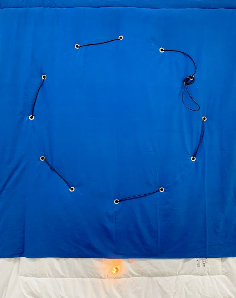
Wieviele Sterne können uns leuchten - blau (detail), 2023, blanket, light bulb, cable, 220 x 130 cm.
Courtesy of the artist.
On the road with the Super 8 camera. It is handy. Everything in Helga Fanderl's filming is handy, simple, immediate. Short films, often triggered by a rhythmic movement. Direct recording of what she sees and is concerned with. The cutting directly in the camera. Pulling the trigger, letting go. No editing of memory. Cutting also in the screening, when she shows a selection of short films in varying combinations. For the duration of each screening a temporary 'film' is created. A mesh of references and contrasts. A cinematic dialogue without soundtrack. In the background, only the whirring of the projector that standsin the middle of the room. At the same time a metronome marking the viewing time. The projection becomes audible and visible.
Helga Fanderl herself projects. She shares the temporality of viewing, which corresponds with the temporality of her filming. Filming and projection are always also performative acts marked by her physical presence. Hidden behind the camera, in the darkness of the projection.
The screening of the films will be followed by the presentation of the book on Helga Fanderl's cinematic practice, which was published last spring and an artist talk moderated by Michael Freerix.
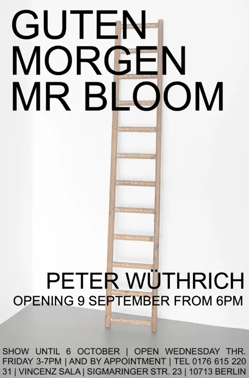
'Since many years Peter Wüthrich has been concerned with the interweaving of word and thing, and "les mots et les choses”, the title of his penultimate solo show at Vincenz Sala, can also be understood as programmatic for his work. The relationship, however, remains tense and sensually charged. In the case of the installation work in the gallery’s Paris space at the time, it was charged not least with the intense smell of the crumpled book pages in which the visitor stood and walked knee-deep.
"Good Morning Mr. Bloom" inverts the synaesthetic interweaving. The word is not artistically appropriated as book-thing (thereby battered since disassembled, crumpled and, glued inside, put on the wall). Rather, the word reaches out to the world of things. It is no longer book that is colour and that occupies the gallery space; in "Good Morning Mr. Bloom” it invades a world of found things. Inscribed with Ulysses quotations these things are integrated into Wüthrich’s stream-of-consciousness, which of course does not stop at the boundaries of language. Another inner monologue, a reading that takes up and keeps Joyce’s ductus and rhythm.
Opening 9 September 2023 from 6 pm
'Writing as something to look at has its place in the gallery's program. So far exclusively in the section 'handwritten', that is drawing. Adib Fricke's work is not at all about handwritten drawings but about words set in block letters. A work on written language that engages in a multiply varied breach of word, a literal breaking, crossing through and at the same time untwisting of the word. Fricke's 'HOW TO LOOK AT WORDS' approaches the word this side of its communicative context and signification.
Above all, Fricke has created a magnificent world of words. The stripped-back, minimalist typography he developed remains grounded in the common aesthetics of the world of type and letters that surrounds us, but carefully composed and in bold color. Even the plain black and white he uses in his work insists on a luminosity that wants nothing to do with the truth value of the proverbial "black on white." Fricke's words have no exchange value. They do not want to be spoken to a counterpart, they want to be read. A reading, however, that cannot help but engage in the "literal" power of color - it's always not just reading but a 'LOOKING AT WORDS'.
The textuality in Fricke's work is about playing with the word's legibility. It engages this early learned cultural technique of reading and the inescapable conditioning that has to turn any sequence of letters, no matter how colorful, into some word. Even if the word, as in the case of Fricke's protonyms, developed some years ago in his 'The Word Company', lacks any meaning and can at best be used as a personal or brand name. This almost compulsory reading puts up with just about any odd sequence of letters. We are pleased, probably also relieved, to find that Fricke's conscious, often unpronounceable lapses of pen, his moving of vowels and consonants within a word, almost immediately reveal their meaning. It's a thoroughly learned and astonishingly prompt deciphering providing a kind of quiet happiness when encountering the friction between the colorfully defaced signifier and the signified showing through.
Fricke's words have their extravagant life of their own, which, in their materiality and physicality, they share with us readers. Whether panel painting, large-format poster, or installation work in space, the set words remain unspoken and present themselves to our reading in their colorful appearance. Even in his works with orthographically and grammatically correct sentences, one encounters this quiet self-referentiality of admittedly bold presence. Thus, our looking at Fricke's treasury of words is immediately followed by a reverberation, a lingering monologue that even has an approximate voice: one's own.
Opening 22.4.2023 from 6 pm
'The circle has some prominence in Saskia Wendland's drawing work. Not only as a recurring form, but also as a performative act of circling, as a physical, form-giving action. The series of red circles measuring the swing of her arms, which over the past 20 years has grown to 26 drawings, may already stand for this. However, Wendland's circling and circling back to form and line by no means always ends up in a circle. Also, the obvious reference to the Ensō of Japanese caligraphy is as evident as misleading. Wendland studied caligraphy during a two-year stay in Japan in the early 2000s. Though, this encounter did not stop at the appropriation of a cultural and artistic practice closely related to Zen Buddhism.
Wendland is not in the first place concerned with the moment and the ritualized act of drawing a circle, which may result in the Ensō. Nor is it about Japanese ink and paper. Wendland works with pencil and cardboard, and her handling of these materials repeatedly brings her drawing work close to minimalist sculpture. Her drawing is work in space. A space she ultimately shares with the viewer.
Above all, Wendland circles back. The first circle is followed by many others in a self-imposed work rhythm. These circles, superposed one upon the other, leave after weeks and months of practice an almost pasty path of the abrasion of the red pencil. It is a repeating and returning, a practicing and insisting, a constant circling back that only much later comes to a close, finding a peculiar conciseness. A conciseness that owes itself to the condensation of time, of action, and finally of the space of her artistic activity.
This persistence and insistence, this slow, sometimes hesitant circling, is present in a different but similar way in all her works. For instance in her dotted circles, which are also on show. Here it is the plan executed with a fineliner that is at the core of the drawing and presents itself with all the care of its execution. Still a physical, performative drawing, but yet entirely without the arm-waving or otherwise sweeping gesture. Works that ultimately show how the encounter with the other is above all an experience and learning of oneself. Perhaps for Wendland in particular the insight into the time it takes, the slowness of the beat that determines the choreography of her drawing.
Even beyond the circular form, Wendland's drawing is about grasping what she does, about the physical and visual knowledge of form, of the formal aspects of her work, which of course includes the act of drawing, her often enduring performance. Once again, Wendland's drawing is slow, aimed at a physical and visual knowledge of what she does. Not only of the form, but also of the movement that finds the form and follows it. Even in the up and down of a simple curved line. With its slow choreography that rhymes with seriousness and work, this drawing finds an iconic conciseness that fixes and fixes us.
From Walter Benjamin (quoting Franz Hessel) we know, "We see only what watches us." Wendland's drawings watch us. Not as a recording of some tense act of drawing. What watches us and what we see is slow time condensed in the beat of work and life.
Opening 17.2.2023 from 6 pm
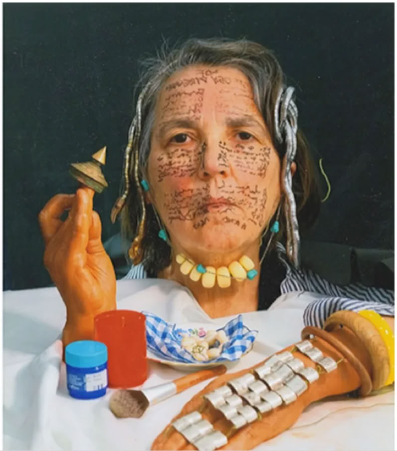
'Treading water' presents Isabel Zuber's repetitive, often serial and essentially performative drawing practice. In small, very small and large formats, as ephemeral, often room-filling wall works in situ and finally as performance of the drawing act, it is above all this: a futile, physical activity. That passes. It may dive in the daily production of volumes of small drawings, or, similarly exuberant, reach beyond the field of vision in her large formats or finally, in the two-handed act of writing, measuring the long unrolling paper up to the arms stretched out as wide as possible. Even in the small format, her writing is always illegible resulting in an unfinished sentence. Micro- (and Macro-) grams that encode nothing and give nothing to decode. Drawings likes scores of the singing of the unfinished sentence in a kind of prosody; beyond the level of the phoneme and beyond the signification of written language. A letting-go and letting-happen that, in ever new attempts, always only just succeeds in refraining from importance and meaning, in attempting the futile.
Especially in the small format, these drawings are like stills of a film that has been running for a long time. A self-portrait from 2003 may stand for this. A 52-minute video that shows her barely moving face as a sort of still life. A portrait that treads water and never intended to get to a point.
At the same time, despite the serial and repetitive character of her drawing practice, despite the performative peculiarity of her work, the validity of the individual drawing is not contested. Zuber's works find to a conclusion and form in every format. And yet they stand in the tradition of performance, referring to Hamish Fulton's "no walk, no work", Tehching Hsieh's "Doing Time" and perhaps also to Robert Walser's walks. An unspectacular walking that is not about getting anywhere, that passes in this slow time and finally has to get back.
The conditioning of this drawing practice, even in the art-context, leads back first and foremost to the own physique. Zuber measures her physical limits rather than the limits of the sheet. (And the viewer measures and sings along). An attempt at only approximate reassurance eluding the hardships that generally drive such undertakings, the idea of progress and coming to a point.
It remains a 'treading water', a futile walking and walking on, as with Fulton from "water to water".
Opening 7.1.2023 from 6 pm
'From a curatorial point of view, there is not much more to say about 'books' than the exhibition title already says. Though, our interest in the subject has a long and rich history. With 'books', it culminates in the presentation of a wide range of most diverse artistic approaches to the book as object, medium and technology. The approach of the opening date has led to one thing in particular: The successive grinding of any remaining programmatic border fortifications. Thus the show gathers bookworks engaging across all genres and beyond. Rather classical artist's books, sketchbooks and leporellos, some from the late 80s and 90s, are included, but also sculptural, installative and conceptual works, a book on a movie and the movie on the book and a website: https://adibfricke.com/die-reise/
We would note, though: The metaphorical reference in that idiomatic expression of'devouring a book' already points to an ambivalence in the reading of books that often gets even somewhat rougher in the artistic work with books. The bibliophilic pleasure has its counterpart. "... Not that you mind the killings. Your book is full of killings ..." says Harry Paul (Robert Michum), the serial killer in Charles Laughton's 'The night of the hunter'. (Minutentexte, the book to the film edited by Michael Baute and Volker Pantenburg and the corresponding film to the book also appear in the side programme of the show). In the artistic production, the book sets the scene for many battles and atrocities. It is cut up, sliced, skeletonized, glued, and, if necessary, provided with a holes in the back for the nail on which it is to hang. With such forms of appropriation and incorporation, there is not much left of the book to read. However, the sensual, bibliophilic experience that the book offers only really becomes apparent with this material battle.
And then: Where one's own working through and digestion of 'important' books in a fairly distant past couldn't help some heavy underlining with a pencil, and later on maltreating the book with neon yellow, green and pink markers, the artist's reading of the book by times completely derails. Inspired by the content, but perhaps even more so by the printed page, the linear clatter of letters and words, the book undergoes much more than a 'working through'. It is transformed into a new, graphically complex state that opens up a new, very different life after the 'read out'.
Finally: The book as the setting for such adventures finally becomes, in a more unadulterated bibliophilic apprehension, the book as time. Experienced time; time captured in photos, sketches, documents; but also the time of book creation and book leafing. With the technology of the book artistic work and its reception enters into the order of backwards and forwards. An order of successive pages to which sketches, photographs, drawings and collages between the covers of the book necessarily conform, even if they resist it. The book is not in the first place an image, but a sequence of images: Film.
And then you close the book, put it back on the shelf and remember.
Opening 29.10.2022 from 6 pm
Participating artists and clips of almost all the books on show can be found here: https://www.vsala.com/books.html
'It is a kind of retrospective that the Berlin-based, internationally active artist and musician Frieder Butzmann presents at Vincenz Sala using video and film technology: In over 50 films and clips, we see works from the last 40 years - thus a large part of his extensive oeuvre as a musician, performer, actor and visual artist - solo or in collaboration with friends and colleagues.
Frieder Butzmann, born in Konstanz in 1954, has lived in Berlin(West) since 1975, where he first worked in the legendary record shop Zensor, soon after founded the venue Luna Park and later toured worldwide as a duo with Thomas Kapielski. Even in Japan, he is considered by insiders to be the inventor of German industrial punk; with his Klingon Opera, the Grimassenalphabet, Gobo light installations, numerous radio plays - most recently a lavish production for Swiss Radio on the theme of love, Sieben Weltrekorversuche (Seven World Record Attempts), and much more, he astonishes his viewers, listeners and readers.
Frieder Butzmann has initiated so many experiments, projects and events that only a few can be listed here - more and more detailed information about his work can be found in the extensive [easy to read] volume "Wunderschöne Rückkopplungen", published by Martin Schmitz Verlag, Berlin 2020.
Frieder Butzmann called himself a crachmacheur, but he is an all-round artist, multi-talent, and ingenious dilettante - the emphasis here is clearly on ingenious! Accordingly, the five hours of film in his exhibition "Nebelkerzen in Dauerschleife" provide deep insights into Butzmann's work and oeuvre, production thoughts and conceptual ideas - moreover, this grand tour creates an extremely complex view of the history of art and music since the 1970s and until today in Berlin and elsewhere.
The exhibition is a joint production of the Vincenz Sala Gallery together with guest curator Peter Funken, who will speak at the opening.
Opening 7.1.2023 from 6 pm
'Es geht also um Wahrheit, Göttinnen und Pop. Nicht Marvel, aber DC Comics. Diana Prince, die mit Gal Gadot besetzte Amazonenprinzessin, schwingt als Wonder Woman in der gleichnamigen Comicverfilmung aus dem Jahr 2017 das "Lasso of truth".
Es war William Moulton Marston, Psychologe und Comic-Fan, der All-American Comics, den Vorläufer der DC Comics, davon überzeugte, dass die Welt der Superhelden Platz für eine weibliche Figur machen muss. Wonder Woman sollte bieten: “all the strength of a Superman plus all the allure of a good and beautiful woman“. Marston ist zugleich als Erfinder des Lügendetektors in eine noch ganz andere Geschichte eingegangen. Allerdings kann Wonder Woman’s “lasso of truth” auch das: dem männlichen Personal der Geschichte das Lügen austreiben. Ein bemerkenswerter Verschnitt, der da als dezidiert feministischer Kontrapunkt schon in den 1940er Jahren die Welt der Superhelden betritt. Wonder Woman lässt sich nicht auf eine oberflächliche Alibifigur zurückstutzen. Sie ist als Amazonenprinzessin gründlicher als andere Superhelden in der griechischen Mythologie verankert. So aufgestellt, nimmt es nicht Wunder, dass sie in den 1960er Jahren als prominentes Motiv in der Popart Karriere macht.
Die bietet noch andere ikonische Frauenfiguren und darauf bezieht sich Sophie Horvaths malerisches Unternehmen. Warhols Siebdrucke inthronisieren Marilyn Monroe als museumstaugliche 'déesse' unserer Alltagsmythen und Horvath erobert dieses noch immer nicht erschöpfte Motiv der Popart für die Wahrheit der Malerei zurück. Die biographische Komplexität der Figur, die die ikonische Verkürzung in Warhols Siebdrucken trägt, kehrt in Horvaths malerischem Cover der Warhol’schen Drucke zurück. Dabei geht es beileibe nicht um männliche Phantasmen, sondern um ein noch immer und wieder wirkmächtiges Imaginäre. Im Medium von Horvaths Malerei wird aus dem auflagenstarken Druck ein Portrait, das in immer neuen malerischen Varianten den Blick auf weit mehr als die Ikone ausweitet.
… In Ulla Hahns vor allem malerischer Arbeit spielt das Foto schon lange eine prominente Rolle. Über viele Jahre vor allem als Vorlage für Fotoübermalungen, die die im Genre des Familienfotos geläufige narrative Prägnanz malerisch überhöhen. Eine ans Bild gebundene Prägnanz, die bei verblasster Erinnerung ans tatsächliche Geschehen die abgebildeten Figuren sicher verdichtet und glättet, aber zugleich in eine Präsenz hebt, die mitunter noch den olfaktorischen Sinn bespielt. Man riecht in die Vergangenheit.
Aus dieser Arbeit am fotografischen Bild haben sich in den zurückliegenden Jahren teils großformatige Galerien in der print-Welt gefundener Frauenportraits entwickelt. Ein wandfüllendes Kaleidoskop aus 300 Frauenporträts im Postkartenformat hat Hahn bei ihrer letzten Einzelausstellung in der Galerie Vincenz Sala präsentiert (Succes, Juni 2019). Und doch geht keines dieser Frauenporträts in der Masse unter, keines wird in einen unzulässigen Dienst gestellt. Es sind Porträts aus einer anderen, aber gut bekannten Zeit und sie erzählen von dieser Zeit, dabei aber keineswegs auf eine nur dokumentarische Wertigkeit zurückgestutzt. Der Betrachter liest Bild für Bild, meint hier und noch einmal dort eine celebrity zu erkennen, vernetzt die Porträts in die ein und andere Richtung, stutzt auch bei der Begegnung mit lookalikes, und findet sich vor allem eingetaucht in eine unabgeschlossene Vielfalt komplexer Biographien, die greifbar werden. Hahns Frauengalerien blättern die allenthalben präsente ikonische Verkürzung, die das wirkmächtige Imaginäre schöpft, in eine Vielzahl distinkter Porträts auf. In „Lasso of truth“ sind es ausnahmslos rauchende Frauen, die die Galeriewand bespielen. Es gibt diesen Nebel kaum mehr, aber man kennt ihn noch und kennt auch den mimischen und gestischen Apparat, der aus dem Nebel vorscheint. Eine vertraute Welt, die nicht ins Schlüssige überführt wird, sich nicht in eine stringente Erinnerung fügt und wieder als auch olfaktorische Einbildung den Betrachter einnimmt.
Es geht bei „Lasso of truth“ um eine andere Wahrheit als die geläufige, die die Dinge auf den einen Punkt bringen will. Eine sozusagen Lasso-schwingende Wahrheit, die viele Bilder braucht,, um den einen (irrigen) Punkt immer wieder neu zu umkreisen. Dafür stiftet das durch ikonische Verkürzung begründete Imaginäre noch immer unabgeschlossene biographische Pluralität und viele Wahrheiten, die in viele gültige Bilder münden. Davon bietet “Lasso of truth” reichlich.
Opening 20 August from 6 pm
Hans is good at making a grand entrance. However, airy, ephemeral and yet baroque at the same time. With the long series of his yellow balloons, he is currently on show in the Kunstmuseum Bonn. Space-filling yellow splendour that drives the viewer into inviting confinement. Hans’ expansive works are of an intimist monumentality.
With Chatroom he invites the visitor to a scaffolding. ‘All Hallows Eve’, the scale replica of the famous walnut pulpit in the Benedictine monastery in Bamberg (a baroque feat dating back to 1756) made, once again, of airy styrofoam, is to be encountered up close, and at eye level. However, the holy staff that adorns the pulpit is found wearing the pumpkin heads of Halloween and equipped with laptops, the insignia of today's communication. A crucified cell phone, literally nailed to the gallery wall, takes up the theme. Above it, hovers a Bell UH-D helicopter, on a scale of 1:20, which proclaims the message "Jesus Allah Buddha loves you" over the Middle Eastern war theatre. These days we’re looking at another war theatre and in our immediate neighbourhood.
Hans’ work lays access points to a (formerly religious) naiveté of understanding long thought lost, which he turns to a pop-inspired secularism. The fact that he lifts the viewer from the depths of the nave to the eye level of the pulpit goes, of course, against all the from-above preaching of the fundamentalists and orthodox of today’s world. The pulpit remains empty (perhaps the tomb, too) and God dead.
Opening on 9 April from 6 pm | Covid 19 restrictions apply.
TILO RIEDEL | Kein Zimmer, Küche, Bad / Heizung Sanitär / Abverkauf / Schichten kälterer Luft / Albtraumschiff
/ Extrawurst / Tobmodells
27 November 2021 to 28 January 2022
To the overlong title, at least this much: Tilo Riedel is on all kinds of stages, including language. It is in this very domain that he has even won a prize for political poetry. (We’d love to provide you with an example but would certainly not want to try a translation of his lyrical work into English; go see the press statement for a German original). On his last solo show in 2012 at Vincenz Sala Paris we said: Tilo is railing (see below). That didn’t change. And there is, of course, no end to railing (the show’s title is a case in point). However, with all these railing chants Tilo is still perfectly soft-spoken. His railing is more like a prayer, evidence of an ironic, by times sarcastic way of reading, and relating to, everyday world. And language, often combined with everyday images, is the stage. But there are other stages and a long history with stages. In the 1990s, Tilo enjoyed quite a carreer in theatre together with his sister, Jutta Riedel. They produced and co-directed their productions and the sets and costumes for these productions were amongst Tilo’s contributions. Most likely key to his conversion from minimalist painter to a “stage worker” constantly checking for the objects, furniture, images and - it’s theatre - the language we’re living with.
We are very pleased that after Paris Tilo is now coming to Berlin for another solo show. It’ll be a stage again. This time a ramp, made of Euro pallets. With a slight incline. So it is sloping and in such a way that the “image-personel” on the ramp is in danger of slipping. The ramp is occupying most of the gallery space hence it does engage the viewer, who feels a bit just from looking at it.
Tilo's work (incl. in the section sculpture/installation) moves metonymically across the ramp, the stage, the linguistic and pictorial space into the seemingly offside. A movement that never reaches a firm end. A work that in its motion draws in everyday words, images, bodies and spaces, and in doing so finds its very own all-absorbing iconography. Eventually, that's how Tilo’s political poetry, his never-ending railing works, and how he creates images of persistingly irritating conciseness. Join us on the ramp!
Opening: 27.11.2021 from 6 pm.
Mit St. Georg bestreitet Andreas A. Koch seine erste und späte Einzelausstellung bei Vincenz Sala. Spät kann man finden, weil beide, Koch und Sala, zum Personal eines Berliner Kunstbetriebs gehören, das schon zu Zeiten der 'Berlinzulage' - wie Christoph Tannert für seine Rückschau im Jahr 2018 treffend titelte - quicklebendig war. Natürlich ergänzen wir unbescheiden: und immer noch ist. Wir freuen uns um so mehr, dass ein dritter im selben Bunde, Peter Funken, zur Ausstellungseröffnung ein paar einführende Wort sprechen will.
'St. Georg', der Titel der Ausstellung, verweist also nicht allein auf die heraldische Anmutung und St. Georg'sche Farbstellung der mit der Abbildung zur Ausstellungseinladung vorgestellten Werkserie, die es mit der Ästhetik des Fahrradflickens aufnimmt. Es geht auch um das Heroische der Unbeirrtheit, mit der Koch schon seit vielen Jahren die Erforschung des Unscheinbaren betreibt, wobei er trotz der langen Jahre nicht im Traum darauf verfiele, ein (drachentötendes) Martyrium zu beklagen.
Koch arbeitet schon immer an der Entdeckung und Sichtbarmachung dieses Unscheinbaren. Seine Arbeiten sind überraschende Zeugen der Unerschöpflichkeit eines Alltags, der gerade in der Dimension des Unbeachteten kleine und zugleich großartige Sensationen zu bieten hat. Die konzeptionell stringente Fröhlichkeit seiner künstlerischen Arbeit widersteht jeder Versuchung, dem Betrachter mit abgeschlossenen Perspektiven heimzuleuchten. Kochs Arbeit formuliert für den Betrachter einen vergnüglichen Auftrag, für den er nun gar nicht behauptet, er hätte ihn selbst schon erledigt.
Seine Pappkameraden mögen als passendes Beispiel dienen. Es ist Kochs Verdienst, die unendlichen Variationen immer schon übersehener Verpackungen seit nun fast zwei Jahrzehnten zu sammeln. 'St. Georg' präsentiert Exemplare dieser Sammlung, die von einer erstaunlichen minimalistischen Gestaltungswucht zeugen und zugleich an die abstrakt-expressionistischen schwarz-weißen Formeln eines Robert Motherwell erinnern können. Es sind Piktogramme, ungefähr menschliche Umrisse, zugleich vielgestaltige Schatten, die vielleicht auch auf biedermeierliche Scherenschnitte verweisen und jedenfalls, einmal entziffert als das was sie sind - Verpackungen - romantischen Witz zünden.
Der überraschenden Enträtselung dieser kryptischen Formen steht mit Kochs Zahlenbildern eine Werkreihe gegenüber, die einem gegenläufigen Prozess der Verrätselung folgt. Es sind Arbeiten, die die lesbaren und jedermann gut bekannten Ziffern durch Überlagerung zu einer formalen Komplexität und exquisiten Unlesbarkeit verdichten. Dabei entstehen Kippbilder, die der Betrachter, beim Lesen des Titels dieser Arbeiten, sogleich auf die ihm ja bestens bekannten zehn arabischen Ziffern zurückführt. Eine Offenbarung, die dem schönen Zauber der verrätselten Form nichts anhaben kann.
St. Georg präsentiert schließlich einige ausgewählte Solitäre, die mit Kochs unermüdlichen Ausflügen in die Oberflächen und Untiefen der Alltagswelt weiter bekannt machen. Ein schon lange währendes Unternehmen künstlerischen Recyclings, das eine Vielzahl der Zauberwesen, die unseren Alltagbevölkern, aufpäppelt und dabei vielleicht zugleich dem ein oder anderen Drachen den Garaus macht. Kochs Arbeit bietet eine Schule des Sehens, in der man vor allem den gewöhnlichen Blick verlernt - und jedenfalls nie auslernt.
Opening: 9.10.2021 from 6 pm
Les Ecrits | group show
21 August to 17 September 2021
with works by Myriam El Haïk, Isidore Hibou, Katja Pudor,
Pierre Sportolaro, Saskia Wendland, Isabel Zuber
“Writing is drawing” says Tim Ingold (in 'Lines'). Of course, an important reference for the selection of drawings on show at 'Les Écrits' (after 'Verzeichnen' (end of 2019) and 'traumatic lines' (August 2020) the third and final edition of our trilogy of group shows on the extended field of drawing). However, the reference to Ingold, and also the exhibition title, leads astray in one respect: there is nothing to read! One may be able here and there to decipher a word or perhaps a brief sentence (e.g. Katja Pudor, Saskia Wendland). And more generally all the exhibited drawings have a typeface, are handwritten drawings (Isabel Zuber, Myriam El Haïk, and also Pierre Sportolaro's rather more seismographic recordings of a flight from Berlin to Paris). However, they lack the significance that is essential for writing. They are not text, and only rarely a readable word or short sentence shows up. Thus, whilst 'Les Écrits' provides ample evidence for Ingold's “writing is drawing” there is no drawing that would suggest an “… is writing”.
“Reading” these handwritten drawings must do without much linguistic meaning. It’s writing on this side of language and of the order of the symbolic. Writing in the realm of the allographic. Some sort of, obviously autographic, signature, though, not even bothered to put a name. Nelson Goodman (‘Languages of Art’) discussed at some length the distinction between the autographic and the allographic, emphasizing that for the latter the formal properties of what’s written are contingent, completely irrelevant for the meaning. Whether ink, pencil, or felt-tip pen, the color, size, and shape of the letters, all of these features are redundant, not relevant. The drawings presented at 'Les Écrits' offer nothing but that. Thus, the viewer of these drawings is pushed to follow, above all, the physical act of writing as recorded in the written image. It’s again drawing as a purely performative act, as doing, in some cases almost doing nothing (Sportolaro) and finally simply waiting (Isidore Hibou's 'Till Death Dries').
However, the viewer is well equipped for this kind of reading. Having undergone himself the lengthy and laborious exercise of learning to write is there to help. It’s in the dimension of the physical, of the own hand conditioned by that exercise of learning to write, that the viewer relates to these works. A kind of bodily tracing of the recorded act of writing in the shared world of the fine motor skills of the hand. A tuning in and resonating that refers to the automatisms ingrained in the viewer’s body and procedural memory. And one wonders how Roland Barthes' famous question about the romantic ‘Lied’ would have to be reformulated for this kind of drawing. The question was: "What sings to me, who hears, in my body the song?"
Opening: 21.8.2021 from 6 pm.
group show
long table
eventually ending pandemic story
vincenz sala
sigmaringer str. 23
10713 berlin
tel.: 0176 615 220 31
december 2020 - may 2021
XL/XS
click artworks
on and next to the
table for more
visuals
TRAUMATIC LINES | group show
22 August to 18 September 2020
with works by Alice Dittmar, Ursula Döbereiner, Abdessamad El Montassir, Myriam El Haïk, Stella Geppert, Jochem Hendricks, Natalia Jaime-Cortez, Käthe Kruse, Ulla Hahn, Marc Rossignol,
Pierre Sportolaro, Saskia Wendland
The exhibition proposes a linking of the works on show focusing on the variety of ways they bring layers and levels of the physical into play. The pen that draws, and what in some of the works replaces that pen, becomes a tool that not just draws but also scratches, stitches, and cuts; that becomes part of a process engaging the body, pushing and pulling it into the center of the artistic events. A body that, probably more than anything else, incurs the drawing, is exposed to and befallen by it.
Obviously not just the body of the work, the picture base. The physical assault is also incurred at the other end of the pen. The hand that draws has been physically shaped by the backbreaking repetition of letters, by this physical conditioning necessary to learn the craft of writing. The automatisms in the developed fine motor skills of that trained hand imply forms of control where in many respects the conscious and even the unconscious have not much of a say anymore. Some immediate physical authority is in command, and not just of that trained hand that doesn't write anymore, that is even in some of the works replaced by prostheses (Hendrick's eye-scanner, by the way this time recording the reading of the first page of Freud’s Traumdeutung, Geppert's headsets, Kruse's sewing machine). The drawing happens, is incurred, informed by some choreography (Geppert, Rossignol), or a ritual (Wendland’s big circle, Hahn), or just a set of simple rules (Dittmar, Döbereiner, El Haïk, Jaime-Cortez, Wendland). In particular minimalist repetition by times to the point of physical exhaustion is at work: Hatching for large and small formats in Döbereiner’s and Dittmar’s work; Wendland's small circle of countless, meticulously set points; El Haik's interweaving of equally countless stylized Arabic characters; and also Hendrick’s egg-formed glass bowl with the literally counted (!) 10,258,743 grains of sand in it.
An exhausting, self-forgotten and self-remembering repetition, for which in some way Sportolaro's glowing heating rod may stand. You can watch it through a recessed window, orange-glowing in a freezer compartment, melting the ice until the built-in temperature controller switches the current from the rod to the freezer’s heat pump; which in turn, due to the falling temperature in the freezer compartment, switches the current back to the heating rod; and so on. A slow loop drawing the viewer to engage and not just watch but literally sense the never-ending small-scale drama of that fight between the heating rod and the freezer’s heat pump.
Opening: 22.8.2020 from 6 pm
Modes of memory have long been an important topos for the gallery. So far, the focus has been mainly on the medium of drawing, especially as a record of the physical act of drawing. A testimony to a performance without an audience, recalling and retelling that event. In many ways a dance without choreography, drawing out the physical and finding its notation in the drawing. By times, it turns into a sort of inscription like tree rings, that remember the drought of last year’s summer for generations to come.
For Marianna Ignataki too, drawing is the primary medium of her artistic work. And the dance, the performance, is an important, recurring motif for the mostly large-size drawings in her solo show at Vincenz Sala. However, her sculptures, artfully put on from black hair, stand in the foreground. Breath-taking pieces reminding of totems. With bulging dark lips and swellings that emerge from black hulls and the overfilled hair. An only vaguely identified sex is present all over.
The subject of hypertriosis and hisurtism in Ignataki's drawings from previous years returns in these sculptures. The phenomenon is known from the hairy freaks that appeared in the sideshows of the beginning of the last century. Though, Ignataki's preoccupation was mainly triggered by her encounter with hair in the Chinese culture, during the years she lived in China before moving to Berlin. Eventually, hair became the key motif and material of her sculptural work. Again a memory that has become physical, and at the same time a layer of self well before the conscious and even the unconscious. What has happened is physically inscribed in the hair, quite similar to the tree rings mentioned before. But there is also the curl of the loved one carried in some distant past in a medallion. The curl that has grown out of life and the loved one, cut off and yet not dead, driving a hallucinatory often also olfactory recall.The loop in the title may have once tied the curl. It refers to the sprawling yet braided hair, which in Ignataki's drawings reach out for the other as physical extensions in a snake-wise fashion. It stands for the bond, not just a memory but this mysterious physical knowing of the loved one. Perhaps by times also replacing that loved one. The reference of the curl is the 'pars pro toto'.
Opening: 30.5.2020 from 4-9 pm
SEESTÜCKE | group show
15.2. - 14.3.2020
with works by Pablo D’Antoni
Hendrik Krawen, Tilo Riedel
That it could be hung on the head was Goethe's comment and meant as devastating. A comment on Caspar David Friedrich's ‘The monk by the sea’, which, nonetheless, and to a large extent due to Kleist's enthusiasm gave quite a push to Friedrich's career. Not his monk, but instead the seascape genre and more generally landscape painting got turned upside down by Friedrich. Which over time resulted amongst other things in that the monk or whatever stood in these paintings for the human measure exposed to the forces of nature vanished from the imagery (see Richter’s seascapes in last year’s show in the Bilbao Guggenheim).
In the group show “Seestücke” (seascapes) this human measure may have changed sides, now standing next to the artist and viewer in front of the image. Yet, which way the seascapes have to hang is obvious. That is not the kind of abstraction they are guilty of. But it's still about measuring and, ultimately, variants of miniaturization of shrinking. That is where the somehow surrealistic detail of Hendrik Krawen’s drawing of giant tankers on his oversized, greenish shimmering canvases meets with the almost acrobatic artistry of the seascapes Pablo D’Antoni squeezes on (literally) nail heads. Megalomania of the kind you may know for instance from Hamburg’s miniature wonderland, the world’s largest model railway (see here), blows through these seascapes - and culminates in Tilo Riedel's upfolded paper model of a cruise liner measuring almost 3 meters presented behind a VIP barrier with a fat red cord, which, as it should be, hangs almost down to the ground between two fluffed up, golden posts.
“Seestücke” is about the real and man-made, examining different scales of turning it into this shrinked, megalomaniac wonderland on the other side of the VIP barrier. In the meantime not just the monk but also nature vanished from the imagery.
Opening: 15.2.2020 from 6 pm